I'm currently learning how / writing code to convert spectral data to XYZ color space values, using various color matching functions

One thing often overlooked is that the CIE 1931 2° color matching function is not ideal to match monitors in the first place for several reason:
– When you look at a monitor, the field of view used represents a lot more than 2°
– Further research since 1931 characterized the average eye's spectral response a lot better

Wide gamut displays like OLED, LCDs equipped with quantum dot film or furthermore LCDs with laser backlight can produce color primaries with narrow spectrum.

In case the wavelengths composing these primaries fall where the CIE 1931 XYZ function is not so precise, it turns out color matching between displays of different technologies simply doesn't work anymore. Like way off.

As an illustration, you probably have seen an AMOLED equipped smartphone that was too green despite the manufacturer's effort to calibrate it to D65 white point, and measurements with regular tools and software confirming that; but not your eyes.

This +Sony's whitepaper explain they had the same issue when calibrating their reference OLED displays and the solution they adopted.

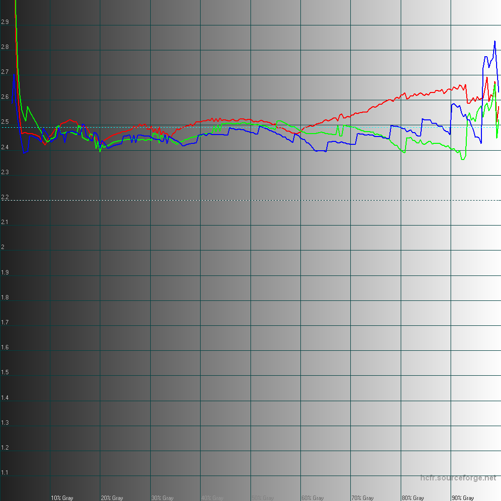
That's another reason why I develop my own display analysis software suite.
The mobile industry is extremely fast at adopting the latest display technologies and it requires state of the art research to keep up 🙂

#supercurioBlog #calibration #color #development


www.wellen-noethen.de/fileadmin/images/news/2014/05-2014/OLED-ColourMatching-WhitePaper.pdf

Source post on Google+

Today, day 3 at #MWC15 was great!

I progressed with the measurements TODO:
– Huawei Honor 6 Plus
– Huawei Mate 7
– Asus Zenfone 1080p standard and with white point tuned to warmer, after the 720p variant measured in different modes yesterday as well
– Saygus V2: I spent so much time talking there too with a very open-minded product manager who selected most of the device's components
– Lenovo VIBE Shot
– Nexus 6, because I didn't had it yet

What didn't work out:
– Sony who refused anything I needed on all their Z3 and Z3 compact running lollipop, the Z4 tablet and M4 Aqua (not a very promising device BTW), I even got annoyed a little bit.
– LG GFlex 2: all of them were running a custom build for MWC, preventing WiFi to work properly which I need for my portable lab.

Then I had the chance to meet by accident +Jeremy Meiss​, +Chainfire​ and a nice +Paranoid Android​ developer I'm very ashamed to have forgotten the name.

There's still a lot in the list, but it was a productive day.

#supercurioBlog #MWC #measurements #display #color


Source post on Google+

Tonight I measured a Galaxy S6 unit in all its screen modes:

– Adaptive display
– AMOLED cinema
– AMOLED photo
– Basic

To anticipate some marketing or analysts claims, here are graphs and data representing the display of one unit, at 100% brightness.

Note: Those are based on preliminary results from a colorimeter only and I will apply some corrections based on the readings of a spectrophotometer.

If you look only at the 2D CIE 1932 gamut and saturations graph, the gamut and saturations seems to match rather closely to the sRGB or Rec.709 standards. It will affect the CIE diagram slightly but not the curves.

However it would be a mistake to claim that this display is color accurate to any existing standard, the reason being that the grayscale luminance and gamma response are wrong.
In fact, the average gamma ends up at 2.49 here which is really high: it makes things darker and more contrasty than they should (an approximate average gamma is 2.2)

So while the screen might look satisfyingly accurate if you look only at one particular graph, the Galaxy S6 display in Basic mode can't be trusted for color-critical work like video or photo editing.

Also, because of the correction required to reduce the saturation that's mechanically increased by a higher gamma, the overall appearance in Basic mode is inconsistent, and looking "off" to a trained eye.

There's more to say about the other modes but that'll be for later 🙂
The real #MWC15 starts in less than 8 hours!

Don't hesitate to point authors of a claim like "very accurate display", "most accurate ever" to the graphs attached.
They're making a mistake in their analysis: you can't look at only a fraction of the data, represented in a specific way and claim that it validates all the rest. But apparently it's a very common mistake.

#supercurioBlog #display #measurements #color #critic #Samsung


In Album About Samsung Galaxy S6 Basic screen mode

Source post on Google+

+Neil Harbisson is a gentleman who's eyes can't see colors, so he decided to extends his perception with a device transforming color hues into sound tones

Now he makes art with his new sense, and also a little bit of philosophy as +BBC News shares in their video.
I liked he's able to capture and describe more than regular humans can see, because he's sensitive to infrared and also gets readings of hues instead of actual colors.

#supercurioBlog #color


The man who hears colour

Source post on Google+

Color is consistent and close enough to content creators intent in movie theaters because each calibrate their projectors and screens

I've been fascinated by this explanation on how calibration was done for film distribution with inevitable deviations due to the analog nature of the process.

In this video, +CineTechGeek​ shows it consists in calibrating essentially the primaries coordinates. I wonder what the response curve is tho: I suppose essentially linear with a rolloff in highlights?
Cool stuff, I'll watch more or those videos to continue learning about it 😊

Via +wolfcrow

#supercurioBlog #color #video #calibration

Source post on Google+

Shoot; after adding support for latest HCFR versions I realized that they're unable to display the high precision measurement correctly

As you can see from simulated measurements shown here, both Luminance and Gamma graphs are crapped up on current HCFR 3.1.6, compared to the old 3.0.4.0 version (from April 2012).

On the CIE 1931 gamut and saturations graphs, the saturation targets are actually nice on the new version, but the errors when visualizing the curves are a deal breaker.
Well, a little bit of time lost it seems, but I'm still targeting a public release soon.

#supercurioBlog #color #calibration


In Album Old vs New HCFR visualisation

Source post on Google+

But that's not all – this is actually the first phone with an AMOLED screen that is as faithful in rendering hues properly – color and grayscale errors are minimal

The only downside to the Note 4's panel is its gamma value of 1.97, which is below the reference value of 2.2 – the iPhone 6 Plus is close to perfect, at 2.18. In practice, this means that the Note 4 delivers a punchier, more contrasty image than it should, though the effect is not so overdone as to be annoying or distracting.

Average gamma: 1.97
Incompatible with:
– grayscale errors are minimal.
– this means that the Note 4 delivers a punchier, more contrasty image than it should

Conclusion: +PhoneArena authors need some more training on display analysis.

Explanations:
Assuming the average gamma is indeed 1.97 and it is not measurement error and/or inadequate measurement methodology.
A gamma that's too low means the response curve is too high, too bright.
A gamma of 1.97 will give a fairly washed out appearance and the appearance of lack of visual contrast and punch to the images.

Gamma at 1.97 is a pretty large deviation: grayscale error can't be minimal.
It also has the exact opposite effect than what +PhoneArena describes: "punchier, more contrasty image than it should"

It's nice to have some data, but some appear to be invalid and conclusions are contradicting the data.
Not quite there yet +PhoneArena

#supercurioBlog #display #color #measurements #critic


Samsung Galaxy Note 4 vs Apple iPhone 6 Plus
Nowhere else does the rivalry between Apple and Samsung cut as close to the bone as with the iPhone 6 Plus and Galaxy Note 4. Encroaching onto true Samsung territory, it’ll be on the 6 Plus to prove itself better than the Note 4, and that will be no small feat given the years of experience that sprung the latter on the scene.

Source post on Google+

Every white balance algorithm has its strengths and weaknesses

No automatic metering nor white balance is gonna provide perfect result in every situation.

I don't think +Tom's Guide calling this "a big problem" is particularly fair in this article.

Their video demonstration of white balance shifting when the scene changes (hand introduced and removed from the scene) is at best inconclusive, that's pretty much the expected behavior.
If you want to know the reason why fixed or manual white balance is sometimes required, well that's it 🙂
Maybe the white balance adjustment could be slower, which would make it less apparent, but that would reduce its efficiency in other scenes with mixed lighting conditions.

Also, this sentence shows the author doesn't get how automatic white balance works, by stating the exact opposite of the reality:
In reviewing some of our test photos, Apple representatives said that the colors may have shifted as the result of changing content in different photos. But that's not how white balance works. It takes account of the color of light falling on the subjects, not on the assortment of subjects in a photo

Everything an AWB algorithm has to work with is the raw pixels values from the sensor, and some knowledge of what was going on before.
It doesn't know anything about light sources, weather conditions, light reflections.

Lastly, I don't understand why they qualify this other example as a problem while the iPhone 6 has onece again the expected behavior: exposing for the faces first when there's people, and preserving highlight to avoid blowing out the scene otherwise:
http://media.bestofmicro.com/H/S/455536/gallery/sean-mike_ip6Plus_w_600.png
which brings much better results than their reference on metering, a Galaxy S5: http://media.bestofmicro.com/H/R/455535/original/sean-mike_gs5.png
However I agree that the S5 auto white balance gets better results but keeping in mind both get a result that's far too blue overall when exposing for the faces.

I'm all for reporting image quality issues, but it works better with reasonable expectations and proper understanding on how things work, especially when trying to explain that to readers.

Via +Amon RA

#supercurioBlog #color #camera


The iPhone 6 Camera Has a Big Problem: iOS 8

Source post on Google+