This is how I simulated sun today!
#supercurioBlog #display #color #measurements #Samsung

The display didn't look so great in person but the booth's ambiant lighting was making any subjective evaluation particularly difficult.
It's nice to have access to many devices to measure so easily 😊 at #MWC15
#supercurioBlog #MWC #display #measurements #color

– Adaptive display
– AMOLED cinema
– AMOLED photo
– Basic
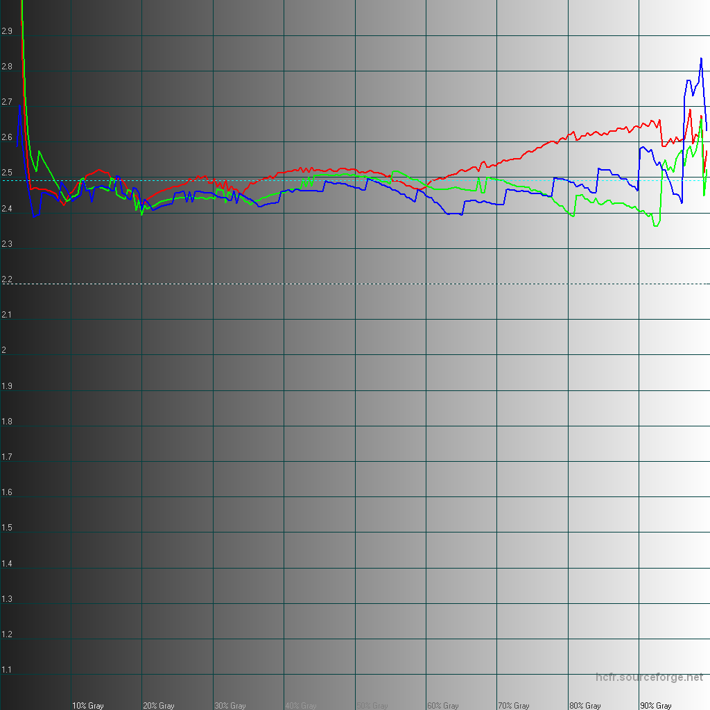
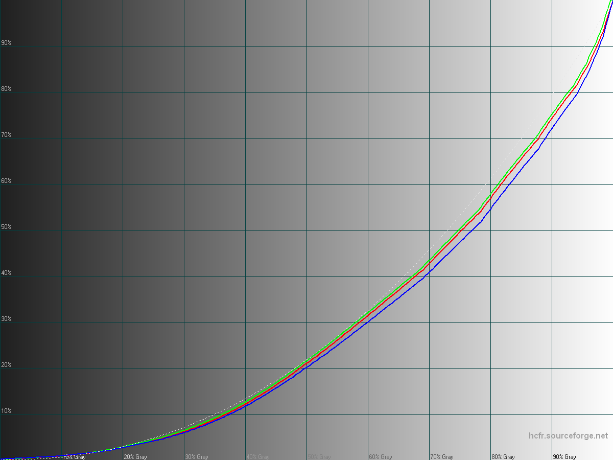
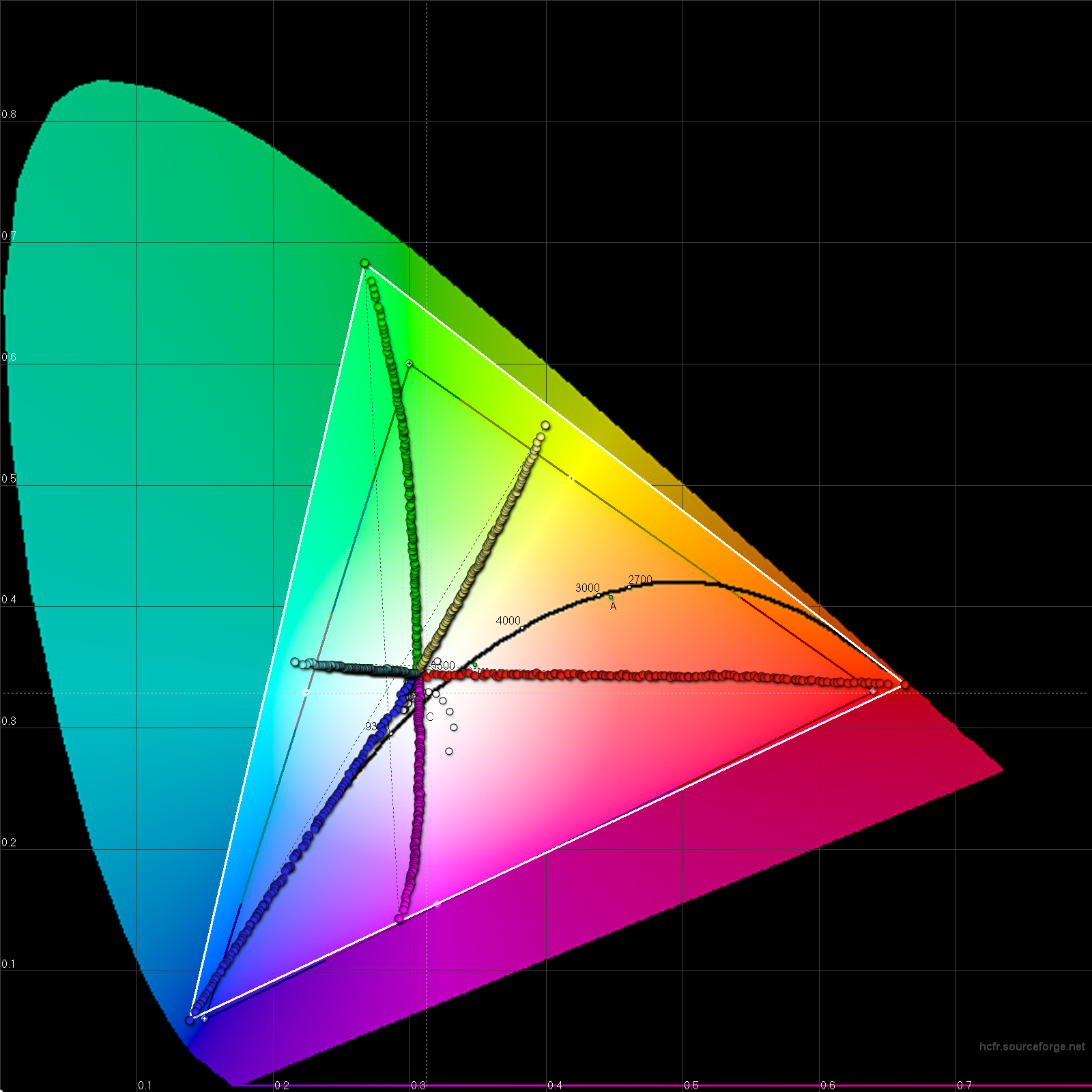
To anticipate some marketing or analysts claims, here are graphs and data representing the display of one unit, at 100% brightness.
Note: Those are based on preliminary results from a colorimeter only and I will apply some corrections based on the readings of a spectrophotometer.
If you look only at the 2D CIE 1932 gamut and saturations graph, the gamut and saturations seems to match rather closely to the sRGB or Rec.709 standards. It will affect the CIE diagram slightly but not the curves.
However it would be a mistake to claim that this display is color accurate to any existing standard, the reason being that the grayscale luminance and gamma response are wrong.
In fact, the average gamma ends up at 2.49 here which is really high: it makes things darker and more contrasty than they should (an approximate average gamma is 2.2)
So while the screen might look satisfyingly accurate if you look only at one particular graph, the Galaxy S6 display in Basic mode can't be trusted for color-critical work like video or photo editing.
Also, because of the correction required to reduce the saturation that's mechanically increased by a higher gamma, the overall appearance in Basic mode is inconsistent, and looking "off" to a trained eye.
There's more to say about the other modes but that'll be for later 🙂
The real #MWC15 starts in less than 8 hours!
Don't hesitate to point authors of a claim like "very accurate display", "most accurate ever" to the graphs attached.
They're making a mistake in their analysis: you can't look at only a fraction of the data, represented in a specific way and claim that it validates all the rest. But apparently it's a very common mistake.
#supercurioBlog #display #measurements #color #critic #Samsung
The only downside to the Note 4's panel is its gamma value of 1.97, which is below the reference value of 2.2 – the iPhone 6 Plus is close to perfect, at 2.18. In practice, this means that the Note 4 delivers a punchier, more contrasty image than it should, though the effect is not so overdone as to be annoying or distracting.
Average gamma: 1.97
Incompatible with:
– grayscale errors are minimal.
– this means that the Note 4 delivers a punchier, more contrasty image than it should
Conclusion: +PhoneArena authors need some more training on display analysis.
Explanations:
Assuming the average gamma is indeed 1.97 and it is not measurement error and/or inadequate measurement methodology.
A gamma that's too low means the response curve is too high, too bright.
A gamma of 1.97 will give a fairly washed out appearance and the appearance of lack of visual contrast and punch to the images.
Gamma at 1.97 is a pretty large deviation: grayscale error can't be minimal.
It also has the exact opposite effect than what +PhoneArena describes: "punchier, more contrasty image than it should"
It's nice to have some data, but some appear to be invalid and conclusions are contradicting the data.
Not quite there yet +PhoneArena
#supercurioBlog #display #color #measurements #critic
Samsung Galaxy Note 4 vs Apple iPhone 6 Plus
Nowhere else does the rivalry between Apple and Samsung cut as close to the bone as with the iPhone 6 Plus and Galaxy Note 4. Encroaching onto true Samsung territory, it’ll be on the 6 Plus to prove itself better than the Note 4, and that will be no small feat given the years of experience that sprung the latter on the scene.
You'll find also the usual:
– 2.35 gamma instead of 2.2 but "very good accuracy"
– only 21 color measured at only 100% and 50% saturation to be sure not showing too much of the color deviations
I couldn't read the whole thing, my BS detector was tripped up to angry levels this time.. color management! oh come on. I have no words.
This whole series of "shoot-out" is either result of manifest incompetence or purposefully misleading (or both)
#supercurioBlog #color #measurements #critic #display
Galaxy Note 4 and Note Edge OLED Display Technology Shoot-Out
Introduction. A key element for a great Smartphone has always been a truly innovative and top performing display, and the best leading edge Smartphones have always flaunted their beautiful high tech displays. The Galaxy Note and Galaxy S series are flagship Smartphones for Samsung to show off …
Issues encountered:
Luminance curves: shadows are too bright, upper mids and highlights are too dark.
Too much blue and green (or not enough red), getting bluer in shadows and extreme highlights
Contrast ratio measured at 718:1 on this unit.
Max brightness gets to 332cd/m², however outdoor readability seems still okay.
When the device get warm, it reduces maximum brightness.
As usual, the manufacturer tries to compensate for a misplaced white point by boosting color saturation, introducing even more color rendering inaccuracies.
The saturation boost also tries to compensate the washed out appearance due to inadequate gamma curves but the results is not subjectively not looking nice.
Examples of boosted saturation introducing visible clipping and loss of details:
75% saturated magenta gets +21.5% = 96.5% saturation.
81% saturated green gets +16% = 97% saturation.
The way saturation boost is implemented also decreases colors luminance, increasing the strange looking aspect of saturated colors (most visible on cyan and blue)
What's missing from those measurements:
– Intense sharpening effect applied on every content and can't be disabled
– Slight dynamic contrast, introducing a little bit of banding, serving no real purpose and that can't be disabled.
I would rate it as one of the poorest flagship displays I've seen for a while overall. The sharpening present is off-putting and colors not appealing.
LG seem to have bet everything on "sharpness", focusing on high resolution & pixel density, and then over-killing it with sharpening artifacts.
#supercurioBlog #color #measurements #display #LG
So what they have now is a decent IPS panel, using a blue led as backlight plus phosphors to alter the wave-lengths generated, which results in a wide gamut display with satisfying power efficiency.
Conceptually, having a wider gamut than the common Rec.709 and sRGB is interesting because the human eye can perceive colors so much more intense than sRGB gamut, around in an approximate fashion since CRT monitors.
But let's hold back here: what's a display?
It's a rendering device, reproducing colors previously encoded into numbers or voltages in the old days.
So a good display is what reproduces the colors as they're supposed to. Typically, as the graphic artist intended or as a camera encoded them from what hit its sensor.
As a result what's desirable is both a camera (or artist) and the display agreeing on how to record, encode and present again those colors.
Well that's the basics of display calibration.
Sony has an interesting technology, allowing to reproduce more intense colors and most people craves those, they produce emotions.
But today's content usually are not encoded in a way that can represent those colors intensities.
It's just not here anymore!
Colors that are in nature, that also can be perceived by your eyes but can't be stored in the mathematical encoding of sRGB (computers) or Rec.709 (HDTV) gamut (both share the same)
Sony has this display on the Z2 but unfortunately didn't implement anything to display images according to how their colors are encoded.
Instead, they'll simply let the display stretch colors intensities, and also show the wrong color hues because the Z2 panel RGB primaries are not aligned with sRGB gamut.
That's the typical issue when you're lacking color management.
Instead of converting a color space to another, you're not processing anything and show un-corrected colors.
And then here comes the marketing department, who made this page that totally baffles me by the quantity of bulcrap it contains.
It's pretty much feeding readers lies about color reproduction and accuracy to convince them the oversight is actually not only a good thing, but also right and accurate.
Quoting:
With IPS technology, the Xperia Z2 offers an improved viewing angle. So you get super sharp images and accurate colours, no matter which angle you’re looking at your device from.
All things considered, if you compare to the Xperia Z or Z1 yes the colors are indeed more accurate.
It doesn't make Z2 display a color-accurate display tho.
TRILUMINOS™ technology uses LEDs, which emit purer reds and greens, creating a brighter and more uniform light that captures the true colours of the source. From lush landscapes, to natural skin tones – Sony delivers a significantly wider colour range. So you can view every moment in astonishingly authentic colour and breathtaking quality.
Wait wait wait.
Sony, are you really saying that the display is actually a camera? capturing the true colours of the source.
A camera captures colors. Not a display.
See, that's the rhetoric used to pretend that the display knows (!) what were the colors when captured, and thus can reproduce them accurately.
Needless to say, it's complete nonsense.
Then continuing on, Sony tells you the display renders authentic colour
Science check: that's absolutely wrong. Remember I told you sRGB gamut is far from covering what your eyes can perceive. So if your camera records image in sRGB, those intense colors are gone. Like an intense red will be recorded as a less intense red, that's all.
So how could a display know what the authentic colors were.
Was the display here with you? What does that even means.
No, the display will only render colors encoded to be a specific tone and intensity to another color. Because.
Of course it won't be the real color, unless you get 16.7 millions against one lucky, assuming this color was even part of Z2 reproducible colors.
This new innovation combines red and green phosphor with blue LEDs and customised colour filters to produce a brighter and more uniform light. Capturing true colours without the risk of oversaturation.
The marketing here using a formulation optimized to trigger the placebo effect. And believe me placebo (at any price point) sells with almost no limit when it's about display or sound quality.
Even medicine. But people rightfully take this a little bit more seriously 🙂
So yes colors are over-saturated, it's a measurable fact.
But maybe if Sony tells you they're not you'll believe them. No harm trying right?
The Intelligent Image Enhancer reproduces the vividness of the image in its original colour
Again, same thing. Boosting colors not as selectively as described here won't get you anywhere near the original color.
More nonsense.
If you actually watch video content today on a Z2, the color processing might make you uncomfortable.
They take standard content, stretch colors to the wide gamut of the display, and on top of that boost colors some more.
The result looks simply ridiculous, even on skin tone which is a big no-no.
But well, this is Sony's marketing so nothing new here, I think it's a tradition of theirs for consumer products.
Personally, I really don't like abusive usage of "color accuracy" mentions.
That's why I'm working on measurement tools allowing to verify claims, because color is actually a science.
Also, there's a lot of progress to make thanks to wider gamut displays.
Those are undoubtedly the future, but today's ridicule usage made of them mostly discredits their benefits.
#supercurioBlog #color #display #critic #marketing
Xperia™ Z2
Sony’s best phone camera is the Xperia Z2 which features a 20.7 MP camera and 4K video recording – all packaged inside a gorgeous aluminum frame.
Wow, my calibration algorithm works automatically and with 256 points instead.
That means correcting every single color in the grayscale instead of the usual grand interpolation approximation as demonstrated here.
I also notice that their automatic calibration starts at $299.
#supercurioBlog #display #color #calibration
This is is the mode described as color-accurate here: http://www.displaymate.com/Galaxy_S4_ShootOut_1.htm
Quoting:
The Galaxy S4 Movie Mode provides very nice, pleasing, and accurate colors and picture quality
Movie Mode, Very Good Calibration
Very Good Images, Photos and Videos have very good color and accurate contrast
Based on those high precision measurements, I beg to differ. My rating would be poor or very poor.
Color manipulations are so wrongly done that some secondaries (cyan and yellow) are not even in line with primaries!
Well, this is an example of what happens when using not enough data to cherry-pick evidence that suit your established conclusion.
That's the reason why I'm committed to provide display analysis software and training to any reviewer interested.
The current source , considered as reference is not as good as it should, also possibly biased based on the fact its conclusions doesn't even match the data published.
Anyway. Yay, the new code works great 🙂
#supercurioBlog #display #color #measurements #critic
Previously, my calibration algorithm was supporting only sRGB / Rec. 709 white point D65, of about 6500K.
At home I have two Dell UltraSharp 2407WFP giving me the hardest time to measure and calibrate.
Somehow, their aging CCFL backlight is throwing off every spectro or colorimeter sensor I tried and targeting a D65 white point from the measurements obtained only give a terrible blueish/pinking hue.
Added to that, some kind of dithering or backlight PWM on those displays trips off the X-Rite i1 Display Pro 3 using Argyll as a driver.
Super fast colorimeter; maybe a bit too fast in this context !
Color balance being off should not happen using the spectro measurements, as XYZ readings are not coming from a RGB-filtered light sensor but instead wavelength domain sampling.
But the spectro I have is an old EFI ES-1000 bought used for a cheap price and on this particular display the results are in contradiction with what you can perceive with your own eyes.
With this new math & code, I should be able soon to calibrate those desktop monitors I spend so much time behind.
I look forward to get here as the results of my algorithm surpass by a fair margin in accuracy every other I tried so far.
#supercurioBlog #display #color #calibration


