Look how well Firefox ICC profile color management works!

This test has been realized on Nexus 7 Original.
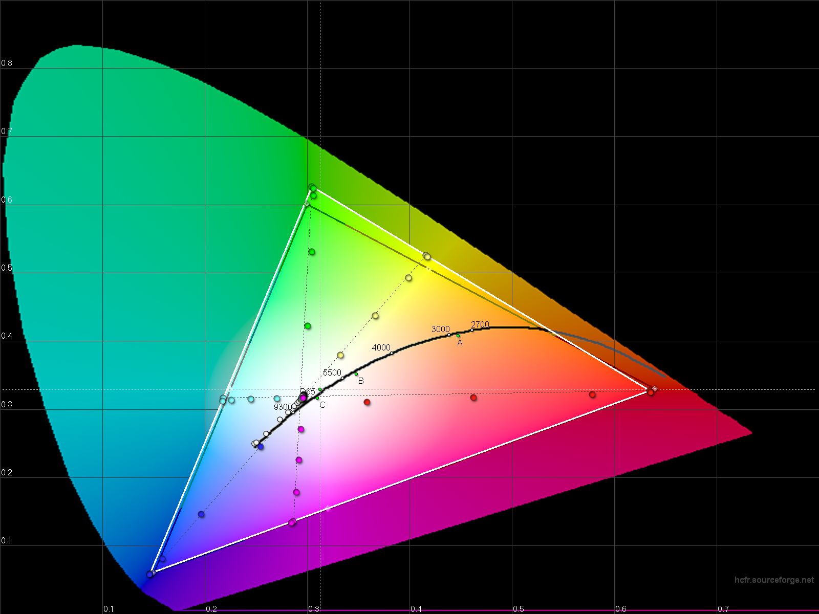
OG Nexus 7 (2012) display is quite under-saturated and generally dull.
Because of it's response curve (too bright) and also because of its weak gamut coverage: lacks in red, lacks even more in green.

In this example, I enabled Firefox Mobile color management support in about:config:
gfx.color_managmement.mode to 1
gfx.color_management.enablev4 to true
gfx.color_management.display_profile to /sdcard/og-nexus7.icc

Defining a color profile in software allows an application to alter the colors before they're sent to the lower levels and reach the display itself.
In the color-managed Firefox browser capture, you'll see that colors look over-saturated, especially Red and Green channels.
It's expected as applying the color profile compensate for the lacks of the display.
On the device itself, it looks just right and much nicer than anything the good old Original Nexus 7 is capable of usually.

A huge drawback today is that Firefox Mobile only renders content in 16-bit colors instead of 24, why you can see terrible banding in gradients.
Because of this, Firefox Mobile for Android is unusable for anything graphic related.
However, there's potential here.

Edit:
Nightly built of the version 26 enables 24bit rendering!

It gives you and idea how color management, at OS or application level is useful, regardless of if you can actually calibrate the display hardware or not.

If the display is not calibrated, color management in software does all the work.
If the display is calibrated, color management in software will only compensate for hardware limitations of the hardware itself like typically the gamut size and coverage.

#supercurioBlog #color #colorManagement


In Album Color management and custom ICC profile in Firefox Mobile on Nexus 7 Original (2012)

Source post on Google+

Do you know any color-managed Android web browser?

Just tested Chrome 29 and Firefox 23, and clearly they're not.

Here's a capture from Google Chrome Browser, the car should appear yellow.

Here's the test website: http://petapixel.com/2012/06/25/is-your-browser-color-managed/

Edit, another:
http://cameratico.com/tools/web-browser-color-management-test/

#supercurioBlog #color #colorManagement


Source post on Google+

In their press release, +LG Mobile states, quoting:

accurate colors and clear images without any distortion

Here are measurements of Korean G2 F-320K display that +Erica Griffin has for review.
What I see in those measurement is a different story that what the manufacturer states.

Some diagram interpretation:

CIE gamut and saturation view:
First thing, gamut is a bit larger than sRGB standard with green reaching further, on y axis mostly which means maximum green will be a tad more intense, it's not too bad and as-is will probably just look nice.
However if you look at the saturation, something is happening here:

Green and Blue channels mostly are extremely compressed.
As a result, green at 75% saturation is above sRGB standard coordinates, blue at 75% saturation is not much different from 100% blue.
Cyan gets the same treatment as green and blue.
Red saturation is less compressed, LG was more careful here as it's easy to make people's face look red so people identify this as over-saturated colors immediately.

Gamma and Luminance curves:
Gamma constantly above 2.2 which is the usual calibration target, and about average of sRGB standard.
Average gamma value ends up at 2.46, with an actual contrast ratio of 1097:1 (dynamic contrast neutered)
What does that means? You can see the result in Luminance diagram: the image looks artificially too dark.
It's not that bad when you're in dark viewing conditions, but kinda extreme for a smartphone you will use also in bright viewing conditions: making some things hard to see.
Making the image darker also automatically increase color saturation.

White point temperature:
It seems LG chose D75 illuminant here as target (7500K) even if a spectro would be required to give a perfectly accurate reading.

My conclusion here is clear:
LG say what people and the press want to hear: "accurate colors" but does something else.
They're also surfing on the urban legend stating that IPS displays have accurate colors, bashing their Samsung in the process (which is well deserved on some aspects). Yet aren't they're trying to mimic them at the same time?

Both selective color saturation increase and gamma and darker response curve are here to make the image pop regardless of color accuracy.
Those two elements seem like an attempt to make this IPS display look like an AMOLED panel, or at least a "vibrant display".

It might look good to some buyers but please, LG, don't state you're calibrating your display for accurate colors […] without distortion while you're applying processing with a very specific agenda, that has nothing to do with color accuracy.

Will the non-Korean G2 have displays that are targeting color accuracy?
We'll know that in a couple days.

#supercurioBlog #display #measurements #color


In Album LG G2 display measurements (Korean F-320K)

Source post on Google+