Issues encountered:
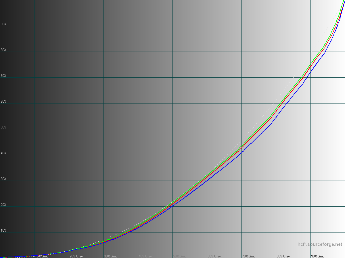
Luminance curves: shadows are too bright, upper mids and highlights are too dark.
Too much blue and green (or not enough red), getting bluer in shadows and extreme highlights
Contrast ratio measured at 718:1 on this unit.
Max brightness gets to 332cd/m², however outdoor readability seems still okay.
When the device get warm, it reduces maximum brightness.
As usual, the manufacturer tries to compensate for a misplaced white point by boosting color saturation, introducing even more color rendering inaccuracies.
The saturation boost also tries to compensate the washed out appearance due to inadequate gamma curves but the results is not subjectively not looking nice.
Examples of boosted saturation introducing visible clipping and loss of details:
75% saturated magenta gets +21.5% = 96.5% saturation.
81% saturated green gets +16% = 97% saturation.
The way saturation boost is implemented also decreases colors luminance, increasing the strange looking aspect of saturated colors (most visible on cyan and blue)
What's missing from those measurements:
– Intense sharpening effect applied on every content and can't be disabled
– Slight dynamic contrast, introducing a little bit of banding, serving no real purpose and that can't be disabled.
I would rate it as one of the poorest flagship displays I've seen for a while overall. The sharpening present is off-putting and colors not appealing.
LG seem to have bet everything on "sharpness", focusing on high resolution & pixel density, and then over-killing it with sharpening artifacts.
#supercurioBlog #color #measurements #display #LG
🙁
G3 looks so nice on paper… Thanks for sharing your tests!
Damn! That's disappointing for +LG Mobile Global
+François Simond Have you performed similar measurements on the HTC One m8? Just curious about my device and how it stacks up.
The m8 does this as well. +Mark Skarzynski , just in different ways.
+Mark Skarzynski yes I haven't published anything tho.
+Erica Griffin is working on her review ATM, you might see those measurements here.
However she's using her M8 with a hacked display calibration using my driver and algorithm ATM.
I'm really glad you and Erica are working as a team, you guys sure do complement each others skills.
+Michael Stanton that's how it works. Humans adjust. But things aren't that way in the real world. If you're showing someone an image that you took and it looked colorful on the device you took it with and then bland when you print it out or publish it via web… Well then that's a problem.
+François Simond You couldn't share that driver and algorithm in a flashable package or a boot loader flashable IMG 😉
+François Simond So, how does the OnePlus One fare?
+Michael Stanton Yep our senses and… even humans in general adjust incredibly to some of the worst situations ^^
Shitty can become fine (even for stuff like relationships) but you can always realize later what was missing or wrong later, and appreciate it.
For color accuracy the idea is to have a standard between content creators and viewers, so both see kind of the same thing.
Like if an artist painted his canvas, in colors and you could see it only in black or white.. or with colors shifted.
It doesn't mean it looks bad in black & white and with different colors, but.. that's not what the creator wanted to share with the world 🙂
+eric ledbetter it's not planned for now as it doesn't disable M8 color saturation boost: not good enough then, only "less bad".
Will these errors be present on the U.S. domestic versions as well?
+François Simond I guess it's time for some "voodoo" magic lol
Out of the 4 flagships (m8, s5, z2, and g3) how would you rank them in screen accuracy/best screen?
I'd be keen to know which ones rank best too
Is there a list of properly calibrated smartphones?
Will people notice this with the naked eye? I am just curious cuz the G3 has so much going for it in other aspects
+Brad Breese color deviations and sharpening are obvious enough to be noticed yes I think.
But everyone's perception differ so it's next to impossible to tell for everyone.
And what some program says means what? Every review I've read says that the screen looks amazing. That's what counts. Not computer scores.
+Bradley Doucet notice that I don't give any "score", intentionally.
Instead I share the actual measurements reflecting the characteristics, instead of a condensed evaluation mixing up many dimensions into a simplistic evaluation.
Also, it's not "some program". I developed the measurement tool myself.
so which flagship has the most color accurate display? i am hoping the moto x+1 is worth the wait
+Brad Breese it's a difficult question to reply to because currently all of them are quite inaccurate in different ways.
Although I developed something new this week end that might help everyone evaluation displays with a "simulator", that's still work in progress but surprisingly representative.
i see. well thank you for your research and development
+Roy Kartadinata sorry I don't intent to hack on the G3, but it would certainly benefit from a higher quality calibration profile and color + sharpening processing settings.
+Julian Andres Klode well I can't really be the manufacturer and reviewer on that ^_^
However when I post on the OnePlus, this is on +Francois@Cyanogen Inc. page as a clear disclaimer.
+François Simond Hey, why not? But seriously, with all the people complaining that it is too warm, it would be useful to know how accurate it is. Hop over to your other account and write. 🙂
+Julian Andres Klode thanks I'll continue communicating about it!
What kind of spectroradiometer do you use?
+Florian Schewe currently, an EFI ES-1000 which is a i1pro UV cut (they can be found at a good price used)